Showing posts with label Identities. Show all posts

Monday, 27 April 2009

Habemus Logo! part 2

This time, animated but without any sound effect added...


I think things start to look a bit more coherent now and I`m certainly glad to be able to put my ideas into practice after such a long time of thinking and re-thinking, sketching and erasing pre-production process. Just goes to show what I have always known about the way I work...if I don`t get it in just the right way I feel I need it to be...no work will get done. I need to figure it out first and then combine the pieces of the puzzle into a coherent whole...and after it makes sense in my head, the possibilities are endless (so I like to tell myself, anyway)...

Sunday, 26 April 2009

(M)ask NOT! part 4 plus bonus!

Aaaaaah...what a fine day this has been...for AV(I)! Let`s see:
1. Good deed of the day that will ensure our accession in to the ` oh so holy and righteous` aerial kingdom of the pearly gates...check!
2. Doing some work on the project....check!
Ladies and archbishops, gents and nuns...I`m proud to present myself as...me! Having participated in the much anticipated sequel of fellow student Steven`s oeuvre Fun in the Square, I hereby provide the precious (preciousssssssss) video:


Numero 2...this is a draft of the video presentation of the avatar. The music will probably be the same (an excerpt from Ligeti`s Requiem, just like with the intro scene I`ve posted earlier), but I`m thinking of adding some text and overlay some images in some of the sections of the video. I changed the colouring of the mask and the overall tint of the animations, so as to make sure the elements that make up the showcase will form a harmonious whole, not just thematically, but also in terms of chromatic choice.

Saturday, 25 April 2009

Don`t make a scene!

So, this is the layout so far, with the camera play.


I might change the pictures corresponding to the sections of the cabinet, but I think...I think...this is the final layout...maybe...

Friday, 24 April 2009

Further down the...road?

My dear and beloved followers (may the gods of financial abundance be upon you!), as you might have observed by now (as I am sure you are paying your utmost attention to all my endeavours) I have the propensity to make somewhat unexpected changes. And by the beard of the prophet!, this is one of those times! The victim...well...the lucky item to have caught my attention and need for reconsideration this time is the interface and overall layout of the project.

Now, as some of you might recall, I have posted a sketch of the previous idea that had been inspired by the mandala, but....lo! and behold, I have ventured to come up with something different. This time, I have been (randomly, you might say) inspired while reading the following paragraph from C.G. Jung`s Psychology and Alchemy :

`The question of where we are going is important...but equally important...is the question of who is going where` [emphasis added]

So, as the author continues his ideas, this notion of introspection is often symbolised by images of mirrors or riddles/riddlers...and I remembered a similar interpretation given the the monolith in Kubrick`s 2001 movie...so...mirrors, spectres, monoliths, pillars (of wisdom)...voila! the magic of free association! You have the `observer` the `in-control` intellect that ventures to seek out the truth by dealing with the ....yes, you know it by now...more obscure and Dyonisian parts of our self (I know this sounds very bombastic....but...you know what?...it comes out the way I wanted it!)


I have made some attempts to put together the scene as it is in the sketch...somehow, there is something I can quite grasp yet in the graphic quality of the images I want. I might give it a rest today and see whether I can come up with something more satisfying later.

Thursday, 16 April 2009

Habemus Logo!

Holy smoke up the chimney of the conclave! This took quite a while and I was loosing hope. Even more so given that I`ve been lacking any ideas on how I would want the logo to look like in the first place. Wish I could show the development and gradual birth of my little baby, but it was as sudden as a....well, sudden! I only made a quick sketch in my sketchbook and swiftly took to 3D Studio Max to profit from the burst of inspiration...the first in the last week (oh God! It is like a breath of fresh air, feelings of guilt over my laziness were getting overwhelming!)


The basic symbolism is of course easily linked to the now infamous Dyonisian and Apollonian shtick I`ve been pulling since the beginning of the project. One, impetuous, ondulating, uncontrolable and unconscious, the other, a steadying force, a thin yet utterly necessary veil laid over the storm brewing underneath...no wholly containing and stopping it (neither should it do that), nor letting it wreck havoc.


Saturday, 4 April 2009

(M)ask NOT! part 3

Ok, so quick changes to the mask, and a bit of tinkering with the lights...and...voila!...something that looks more akin to what I want.


Next thing on the `to do`list: trying out different, and, hopefully, mind-blowing, camera-angles!

Friday, 3 April 2009

(M)ask NOT! part 2

What I`ve been trying to do these past days was making a more personalised mask, using it as a material for the 3d surface, and molding the NURB surface to give it a more `face-like` look. The problem now seems to be that I can`t get the light projector to cast the images unto the mask. I mean, it does so, but I think because of the texture, the reflections are barely visible. So, I`ll probably have to redo the colouring of the mask (maybe go for a darker range of colours?)


Tuesday, 31 March 2009

(M)ask NOT!

Today has been a rather....good day....for modelling...and projecting. My loyal and up-to-date fans, as you all know by now, I have embarked on a quest to build the avatar of my most sordid dreams with virtually no knowledge of 3D Studio Max and with a mounting sense of frustration. Yet, as of today, although of frustration I`ve had plenty of, the evil-spell has been broken....and I have finally come up with something that looks to me like a tempting prototype of my avatar.
Developments? Hmmm, well, I slitghly changed the idea of the surface unto which I would project. The face is OUT, the mask is IN! It fits the idea of volatility and uncertainty because... weeeeeeeell, because we all know that a mask is not someone you trust with your PIN number, right? (wink! wink!)
For this first attempt, I have used the map tool of the lightning effect to project a jpeg, but what I would like to try to solve is the sequence of different images. Might just do different AVIs and then put them together in Adobe Premier, or find a way to create a wide, panoramic jpeg that I would scroll across the surface of the mask...hmmm...will think of that...

Saturday, 21 March 2009

My (proto)type...part 2

While getting my slides ready for Monday`s presentation, I thought it would look much more pro to actually do a Photoshop sketch of my Timeline idea, instead of the dodgy drawings I`ve done initially. Maybe the visual feel of the thing is put across in a more obvious manner....maybe...


So, think of it as a sort of music score, with the music, sound effects and animation tags as indications of what will be placed on the actual timeline. Of course, the text will be (hopefully) more interesting than the random set of words I have chosen for this sketch and will make the whole thing look like a moving poetry (woooooow, someone is really ambitious there!). Memo to me: think of ways to solve the drag interactivity issue.

Friday, 20 March 2009

Music to my ears...

Well, while we are at it, I`ve also been looking up some music to use for different parts of my project. Here are some of the lucky nominees:

G. F. Handel - Sarabande


Gyorgy Ligeti - Requiem (Kyrie)


Arnold Schoenberg - Moses und Aron (act II excerpts)


Aleksandr Skryabin - Etude in D sharp minor op. 8/12


Jocelyn Pook - Masked Ball

My (proto)type...

Last days before the presentation and I`m still working at a slow but steady pace. Well, some people just aren`t impressed by deadlines I guess (memo to my muses: you should have come earlier). Anyhoo, better now then never.
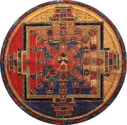
So, I was talking a few days ago about the circular, mandala-like layout of the box. Well, here is a sketch of what I might end up with.


The logo should be placed in the middle, most likely, and the rest of the areas are of course the links to the respective items.

Monday, 16 March 2009

IDeas, please! part 2

While I was pondering on various subjects today, I got one of those brainwaves and I quickly thought I should record the idea. Not sure much will come of it, but it is worth a try. Here it is what I have in mind:


So, it is a timeline, one the user/viewer can follow along by dragging it and what I thought it should focus on is narrative or conveying ideas (might even be something like a stand-up comedy routine, or a collage of lyrics, spoofs of speeches, etc) by using a sequence of different media. Could start off with text, experimenting with font style, size, layout. Then, the idea could be picked up and continued, or nuanced, confused, offered an alternative twist by a picture/collage. Sound could be played at different sections of the timeline, as the user advances through it, again, as an extension of the story so that at any given time, there is something leading on to the next stage. Maybe could include short pixilations, animations (I was thinking shadow plays, but it really depends on the subject of the story at this point).

Saturday, 14 March 2009

IDeas, please!

Well, haven`t had an entry for quite a while now. Let`s see, what progress have we made? Actually, not too much, apart from the theoretical one. Didn`t manage to get my pixilation done as I wasn`t satisfied with the initial idea/story and I couldn`t come up with a new one yet. But, hopefully the next weeks will prove more fruitful.
What I have been thinking about is the avatar and some ideas for the general display of the box showcase. As much as the avatar is concerned, I was thinking of something along these lines:


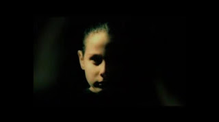
The expressions change as the spotlight moves from side to side, but in a very subtle manner. The expressions themselves should be charged with different and contradictory meanings and messages. I`m not sure whether or not I`m going to use pictures of a single person, or several, but the overral look and feel, with the now infamous (I hope) chiaroscuro would be similar to this sequence of Turkish artist Tarkan `s clip, Verme.


Now, for the display options...I have two ideas so far. One, is to display the elements of the box in a circular, possibly mandala-like shape. That would mean not just a circle, but several layers within the circle, so maybe you could have a story within a story, as the elements that make up the box not only tell something visually as a whole, but also broken up in different segments, areas within the circle. Also, the logo could be displayed in the middle, or, alternatively, the avatar could hold centre stage.


The second display option is a sort of sequential, timeline based unfolding of the elements of the box in a sort of story. The idea is to create a connection between the objects that follow each other, each of them being somehow the effect of the previous ones. I have attempted something along those lines a few weeks ago. The main `story` can be followed by reading the diagonal, from bottom right to left, but it also branches out, signaling turning points within the story.

Wednesday, 25 February 2009

Pret-a-Port...rait

So, my dear guests, if you`ll take a look down the corridor, you will notice two ouvres, both part of the precious `Design Research Task` collection of the Gran Maestro Machi Ticredi! ...

Ah, let`s get back to earth for a second. These are two ideas I`ve had for the portraits made by juxtaposition of symbolic objects for ourselves. While choosing the objects, we had to keep in mind we had to think of our environment, our beliefs, our way of viewing the world and our experiences, as we have convened on a previous seminar that these are essential parameters to define our identity. The objects I have included in the final work are slightly different than the initial seminar material. In the seminar, the package contained: a lightbulb (experience), a book (beliefs), lots of papers with notes, sketches or cup marks on it, sweets wrapers (environment)and a camera (way of seeing the world). The collages have all of these except the camera (although, you could argue that the eye is a reference to the camera) and the sweets.

I guess the next thing to do is expand a bit on the symbolism part. Now, probably the most puzzling one for an outside observer would be the association of the lightbulb with experience. Most of the times, the idea of the lightbulb as the cartoonish representation of the spark, the Eureka! moment. So, in this respect, it is connected with that still unknown territory called imagination and creation. Still, as the day-to-day object we use in our lamps, it also has the technological conotation, and through it, the link to rationality. The way it is included in the first portrait, floating in water (should I remind anyone the whole mumbo-jumbo about water and dreams and the subconscious and all that Fraud...sorry, I mean...Freud stuff?) it emphasises the two ideas that can be associated with it and their contrasting nature.


Books are NOT meant to offer a coherent system of beliefs (sorry for those who thinks so), but propose directions in which one could advance his/her ideas. I don`t have a fetish for books but I know some people who do, so I will try and be as diplomatic as possible. Despite their apparently neutral appearance, books can be condemning, self-righteous and blind to the obvious for the simple fact that they not only shape our beliefs, but are shaped by our beliefs (not just by that of the author). Should I give an example to illustrate my point? Works that have been given hideous interpretations to motivate prejudice (the hand reaching out, as in a gesture of mercy or desperation in the second portrait), hatred and genocide against the other (no, I`m not talking solely about religious texts, I also mean Mein Kamp and Malleus Maleficarum). So, again, a word of caution...and don`t I just love ambivalence?


Using the papers to represent environment, I went for the very thing that my mum has always been made at me for: having piles and piles of scribbled papers, sketches, notes scattered all over my desk. It happens whenever I settle into a new space and create a working environment. I don`t usually take specific things with me if I move (dolls, boxes, pictures, etc), but I re-create this sort of paper-notes-sketches habitat. I used a veil-like material with sparkles on it while taking a photo of some of these papers. I liked the idea because I could use it to give the impression of relief, of `mountains` of paper, but also a sort of fluidity and motion. As they are capturing thoughts, they are a bit like them...fleeting, chaotic, veiled for an outside observer and sometimes...well....brilliant (sic!).
Tuesday, 17 February 2009

Thought bubble of the day (Introduction)

`People will do anything, no matter how absurd, in order to avoid facing their own souls. They will practise Indian yoga and all its exercises, observe a strict regimen of diet, learn theosophy by heart, or mechanically repeat mystic texts from the literature of the whole world- all because they cannot get on with themselves and have not the slightest faith that anything useful could come out of their own souls [...] Ethically, of course, it is infinitely more convenient to leave God the sole responsibility for such a Home for Idiot Children...`

Excerpts from Carl Gustav Jung, Psychology and Alchemy, Routledge & Kegan Paul, London, 1980


Since I am reading quite a lot besides what would be considered directly linked to the area of multimedia, I was thinking of trying to somehow record the process through which I draw some of my ideas by highlighting things that make sense to me. The important thing is that issues raised in this excerpts are interconnected in a more or less apparent fashion with other ideas, that are part of different fields of activity. Yet, what I always found strange is how obstinent specialists in these areas are to a more interdisciplinary approach (even if it is nowadays a notion that gets more attention). People still discover the wheel in some areas, while in others, the same wheel has become a square because of isolation or over-specialisation.

What is the purpose of all this? Well, since my showcase is going to focus a lot on ideas and I will most likely have to throw in some symbolical representation mojo, I might as well try to consciously (as much as one can) follow the trail that leads me down the rabbit hole...here we go!

More episodes to come...

Sunday, 15 February 2009

Chiaroscuro Back...

...although, it was never gone. This technique, applied in painting to produce some of the most `hip` works in the history of art has been picked up by movie makers and photographers faster than you can say `I want to bring sexy back in my composition`. Let`s face it, Murnau`s Faust (1926) or Nosferatu (1922) would be bedtime, clean, boring, family-fun stories without the magic of chiaroscuro (or, if you think that`s not fancy enough, some call it Rembrandt lighting). So, I had read a few things about it a few years ago with regards painting, and now, since I will most probably use it for the Identities project, I have done some looked up Youtube for some advice on how the technique is applied to more recent media (photos, films).

These are probably the most useful, as they demonstrate ways in which one can use the lighting in 3D modelling programs, or while taking a photo, so that you save a lot of time and energy by creating the feel you want right from the process of shooting, instead of massive editing.


Now, for some examples of chiaroscuro in painting...


...and in Kubrick`s Barry Lindon (1975)...


And, I thought I should try and mess around with the concept in Photoshop too. Ideally, of course, using adecquate lighting while taking the picture would give the best results, but I still managed to come up with what I think are some interesting results.


Friday, 13 February 2009

And the modeller said...let there be...

...a humanoid figure. I guess that`s what the end result of our trials and tribulations on this week`s Identities seminar is. Well, he/she/it is very friendly, even in this `ready-to-be-pat-down` position, reminescent of the jolly times we have at the airport security check-in.


So, having enjoyed the making of Sweetie (that`s ...its name), I set myself to work on what seems a rather ambitious task, for today at least. I wanted to make a figure in this posture :


Well, it seems I have a hard time with the bent arm and leg. I think using bones would solve the problem, but, although I`ve been experimenting with the bones in 3D Studio Max, I haven`t got round to adding `flesh` to them. So, it`s back to the tutorials...

Wednesday, 11 February 2009

Mr Freud...analyse this site part 4

Bishonen Info : http://www.bishoneninfo.curvedspaces.com/

The reason why I wanted to have another look at this site and included it in my site analysis is because it stuck in my mind for its peculiar look. It is by no means a glitzy website, shiny and smart...instead, if you look at some of the sections, they strike me as a way of thinking about web design that is more illustration oriented...it is a simulation of a manuscript or print layout. The way information is laid out, it plays a lot with the idea of a dictionary, in case you didn`t get the point about the informative and quite possibly educational nature and value of the site from its domain name.


Another thing that is worth noticing is the eclectic nature of the imagery. It graciously combines photos with black and white, duochrome or coloured drawings or prints, web-friendly fonts with fancy capitals and manages to have several types of fonts on the same page without giving the user a sense of...unease.

Also, maybe it is just me...but identity wise, the authors of the site, whether consciously or not, made the place exude a sort of dandyish arrogance, eclectism and slight contempt for the presumably uninformed or ill-informed visitor, who is ` kindly` taken for a `devil-may-care`, ` we`re-here-we`re-queer` informative ride. Then again, that might just be me...

Saturday, 7 February 2009

Me, myself and....avatar

This Friday`s Identities seminar was all about moodboards and talking about how they can be used to gather the necessary ideas for creating a representative avatar for ourselves. So, this is what I came up with, at least for now. I keep getting new ideas and I`m not yet sure whether I`m going to drop some of them and just choose a specific path to go along or whether I`m going to try and find a thread that joins up all of these apparently different concepts and make it all up into some sort of story...a coherent whole anyhow.

As I was discussing my moodboard it struck me that using the head in the hand combo might work pretty well for the avatar, as it can be used for some really expressive and theatrical poses and to convey some rather....here come the keywords of the project...ambiguous and ambivalent ideas. In this case I was thinking of control as a keyword. What I mean by that is that when it comes to control, the head (mind) uses the hands (oh, it sounds Metropolis...ish) as a mere tool to execute commands. Yet, here, the roles are inverted, the head being vulnerable in the hands of the....hand. The idea is connected to the picture in the foreground. If you are what you become and what you experience, and if we think of experience as a journey...hence, the path...and still the character is in a sleep-like position...the end result is...you are only partially in charge of your journey (still, it`s worth making the best of it).

What Roma suggested was that it would be a pity to loose the aetheral aspect of the character (I used a lot of clarobscuro-like image manipulation, partly because of the recent exposure to German Expressionist movies, partly because as I`ve mentioned in my earlier posts, the effect that this technique can generate simply intrigue me). So, apparently, a good idea would be to use a sort of projection surface...that is, the face would not be completly modelled in 3D Studio Max; instead, I should create a mask-like object unto which I can project the image of the avatar (or images...hmmmm).

Talk about projection...I remember seeing something similar on Susan Sensemann`s site. She projects different images using her face as a canvas. Now, if I could only remember the name of the other artist Roma has told me to look up,it would be great.

Thursday, 5 February 2009

Lights and shadows

I was playing around in Photoshop for the last 2-3 days and I came up with a set of pictures that have a similar, underlining idea and feel about them: faces coming out of the depths of darkness in a pool of light (or a poddle, if you will). I`m seriously thinking of including these into my moodboard and start constructing the whole look of the Identity package around this interplay of lights and shadow. I`m not only thinking of contrast and of opposites when I say light and shadow...what I observed as I was editing the pictures is how altered the general expression of the character or the whole mood that came across from the initial picture was as I moved through the process. From creating the image of the temptress, to that of the girl next door...they are all a push of a button away (unless you have a tempting girl next door...and then they are not far apart in the first place). So, ambivalence, ambiguity...they were words that I chose during last week`s seminar to define myself...and graphically, this style could serve that purpose.